Cayuga Centers
The Concept
Togetherness, evolution and positivity are at the heart of Cayuga Centers. Therefore, these three ideas drove the brand development.
The Visuals
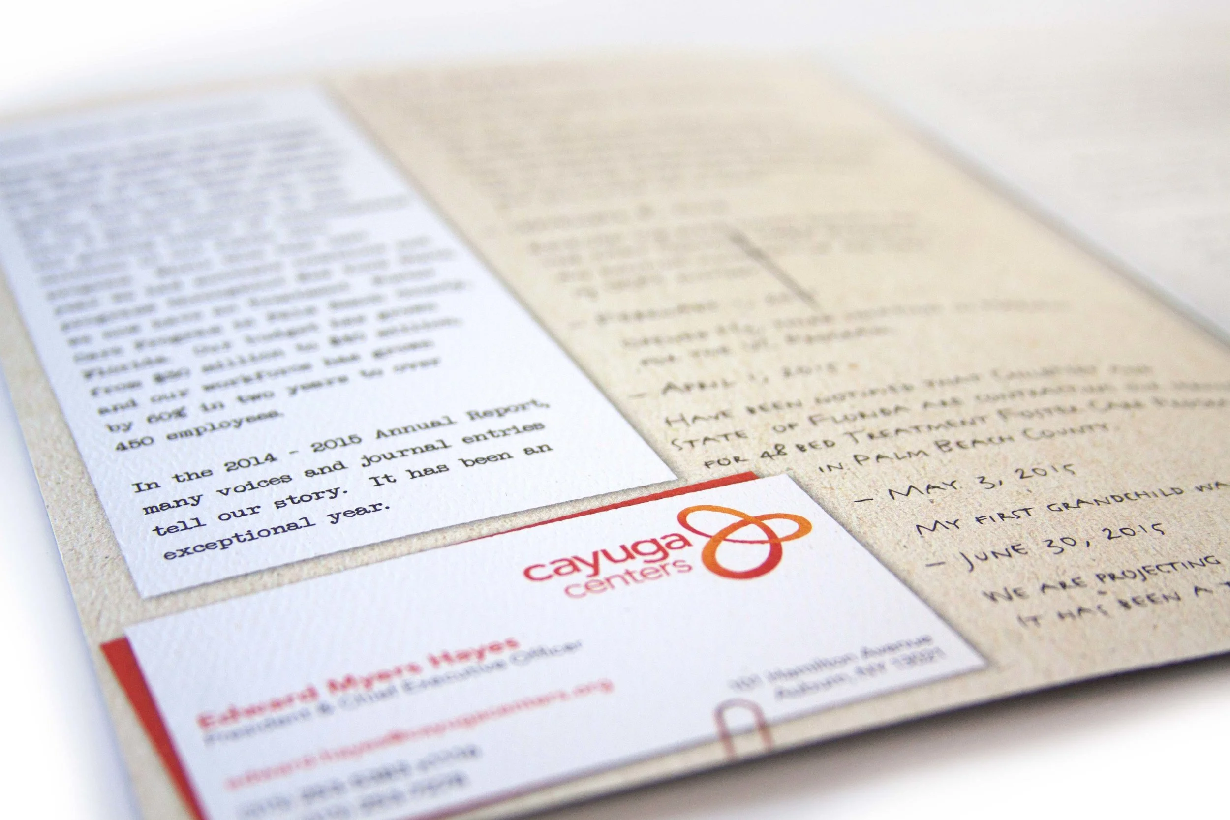
Orange was chosen to represent the positive impacts Cayuga Centers steadfastly strives for. The logo, which was created as a unified flowing mark, represents the ideals of evolution and togetherness. The colors and mark are easily integrated throughout all pieces, seamlessly branding Cayuga Centers.
Logo Design
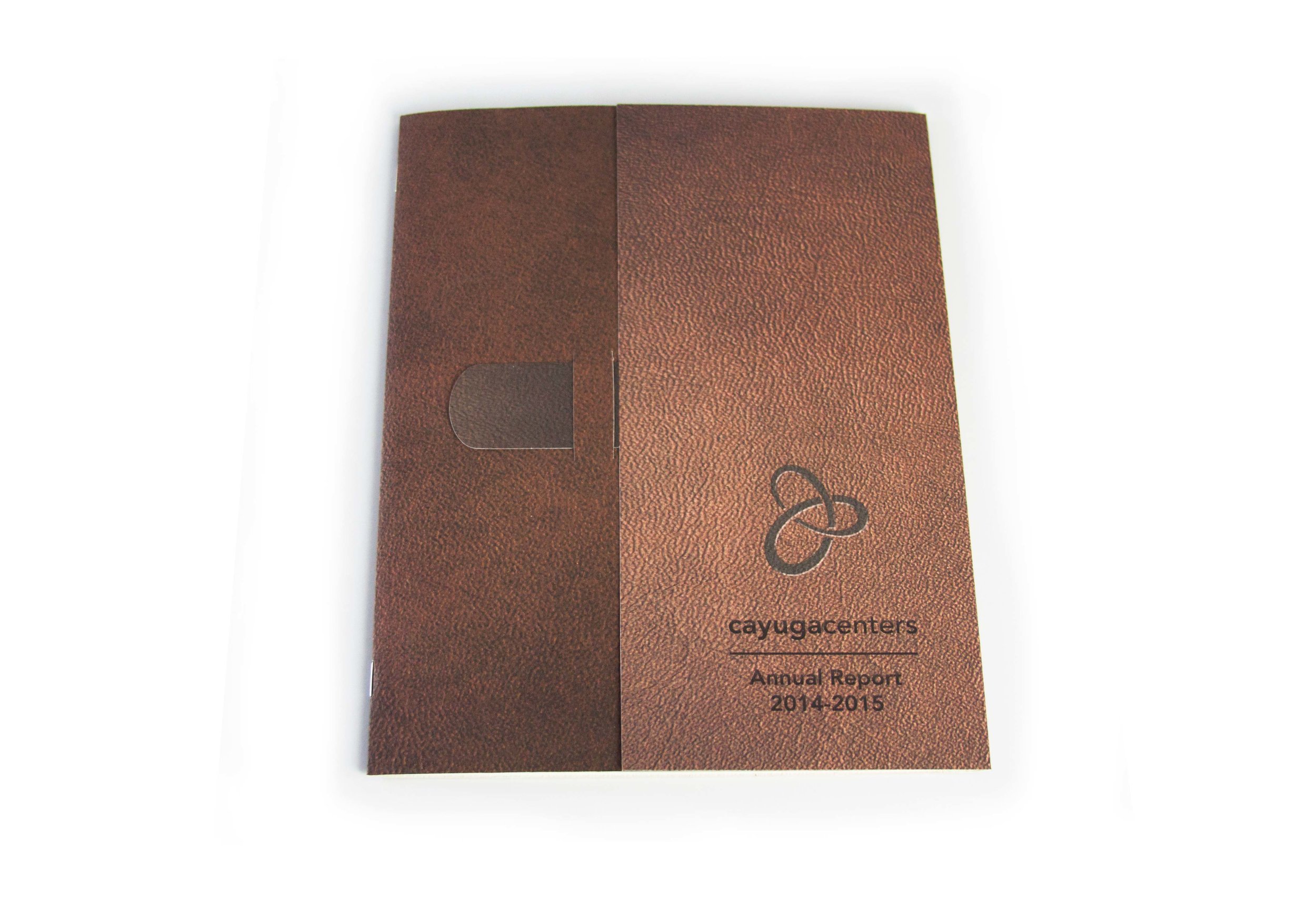
2014-2015 Annual Report


2015-2016 Annual Report


Rack Card Design